
WHEN you look good, you feel good. And in basketball, aesthetics certainly make a bit of a difference in the experience for fans and players.
All 10 NCAA teams certainly tried their earnest to stand out on the court in the ongoing seniors basketball tournament as they proudly flaunt the colors of their alma mater.
Yet not all made hits, as some still fell a little bit short of our standards.
Inspired by Paul Lukas' Uniwatch, Spin.ph ranks who we believe has the best jerseys this NCAA Season 98.
TOP OF THE CLASS
San Beda

The Red Lions really meant business coming into this season: a strong statement that's reflected in their gear.
With a nod to the 1977 championship team led by greats Chito Loyzaga and Frankie Lim, San Beda decked out a flashy kit and moved away from its traditional serif fontface to a slimmer, bolder font.
The product was an absolute beauty from ANTA, one worthy to be placed on the rafters.
Lyceum
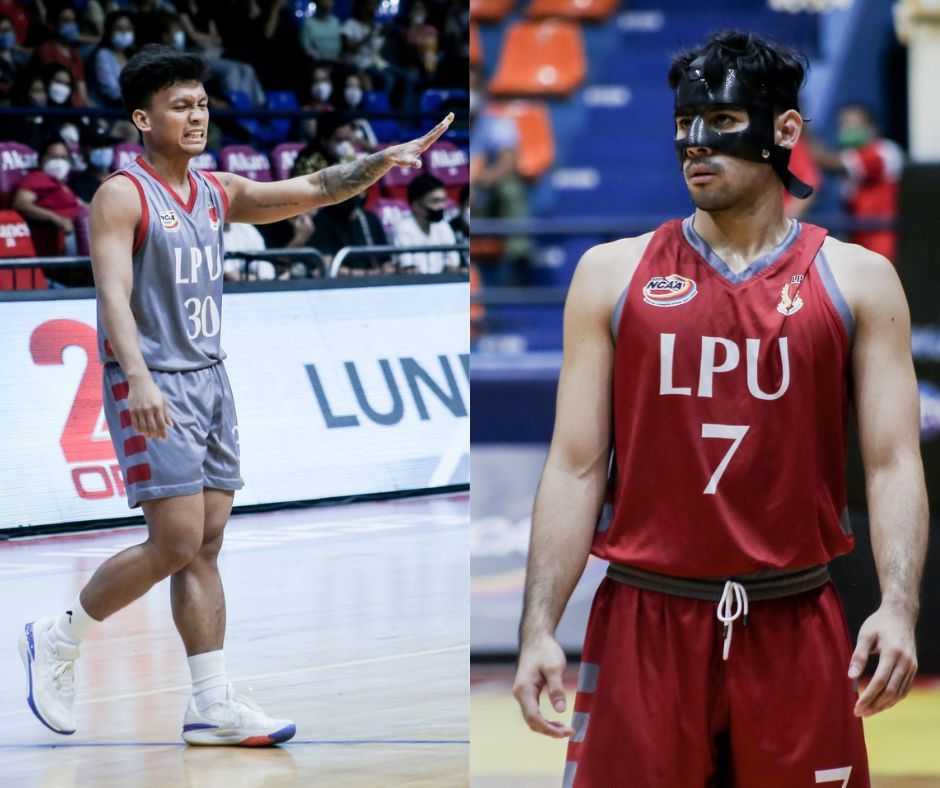
Who knew that a simple tweak of making the names and numbers on the Pirates' jerseys to white could make a world of difference?
This simple approach worked wonders for LPU as the school's name and the players' numbers stood out in its red and gray team colors.
It's really doing more with less, and the bars at the side panels round out an overall solid kit — one that's sleek, but not too simplistic.
DEAN'S LISTERS
St. Benilde
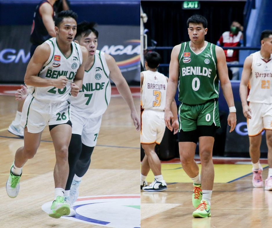
Another gorgeous kit from ANTA, which once again pays homage to team history. This time, Benilde's uniform honors the 2001 championship team led by Sunday Salvacion.
It's a classic yet not too dated look, as CSB injects fun with its rounded font — a unique touch as it veers away from its simplistic approach last season.
The embroidered threads, a deviation from the new norm of sublimated kits, is a big plus as the Blazers really look to stand out from the pack and hopefully end their two-decade Final Four drought.
Letran
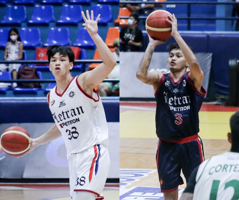
Don't fix what's not broken, right? And the Knights certainly did that.
World Balance did a nice job in keeping the clean and sleek look for Letran while utilizing its team colors of red and blue (red and white for its dark jerseys) as accent in the form of daggers at the side panels for the shorts.
Keeping white as its light jersey is also a positive, although we won't mind seeing the red jerseys from time-to-time, if only as an alternate.
PASSING GRADES
Mapua
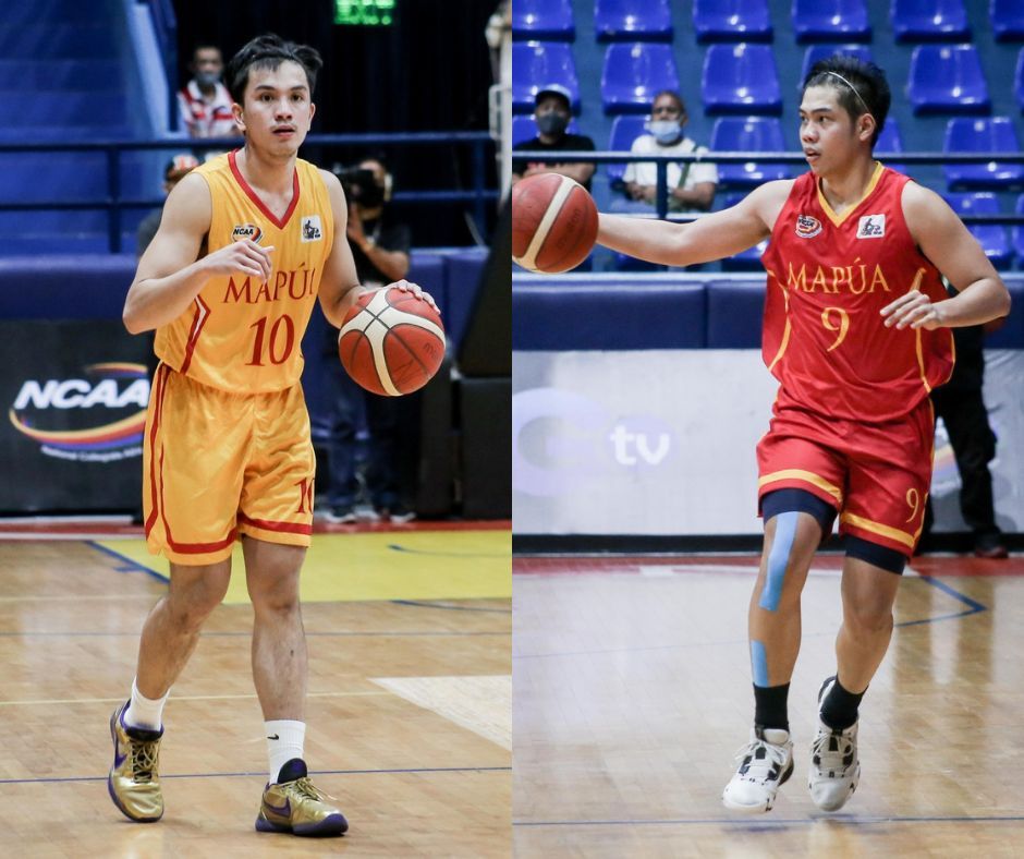
The Cardinals kept things simple this season.... a little too simple for our liking.
Mapua could do a better job on that pattern for its side panels — just to match a bit better with the shorts.
Still, not a bad look for the Cardinals who want to bounce back after finishing as bridesmaids last year.
Emilio Aguinaldo College

Finally, the Generals scrapped the out of place baby blues on their jerseys and went all in on with reds and whites.
The issue, however, is the humungous EAC name in front of the jerseys. It's way out of propotion with the jersey number they have at the front.
Also, the asymmetrical panel at the side makes the jersey feel a little bit unbalanced, but kudos for making that gamble.
BARELY HANGING
Jose Rizal University

Though the Heavy Bombers' jerseys were still solid, the shiny threads feel a bit out of place in 2022.
It also doesn't help that there's a disconnect with the fontfaces of the texts and the numbers, which makes this one a weird combination.
Perpetual

The Altas still got a decent jersey for this year from Rebel Sports, keeping its old English font to compliment its block numbers.
However, why is there a fiery print on the team's side panels? A little out of place, don't you think?
Still, we like how the deep maroon jerseys look, one the team can build on for uniforms for the future.
NEEDS IMPROVEMENT
San Sebastian

Yes, we understand that the Golden Stags want to make their presence known this season, but there's just too many things happening here.
From the old Western font for its numbers to the diamond design on the side panels, San Sebastian's jersey piles on the elements.
One nice touch we applaud, though, is having the redesigned Golden Stags logo placed on the upper part of the shorts. Other teams should take notes.
Arellano

To be fair, it's really hard to pull off a jersey with the blue and gray colorways. The Chiefs, though, seemed like they really didn't even try.
From the uninspiring block letters, to the name of the school arching around the player's number, to the side panels with the motivational text, nothing's hitting the mark in this kit.
Judging by just the looks, this one's a dud.
Get more of the latest sports news & updates on SPIN.ph
NOTICE ON UNAUTHORIZED AND UNLAWFUL USE, PUBLICATION, AND/OR DISSEMINATION OF SPIN.PH CONTENT: Please be notified that any unauthorized and unlawful use, publication, and/or dissemination of Spin.ph’s content and/or materials is a direct violation of its legal and exclusive rights to the same, and shall be subject to appropriate legal action/s.