
REMEMBER how the old saying goes: If you can't perform, japorms.
We doubt UAAP players would trade basketball skills for basketball fashion, but this doesn't mean that they can't be stylish on the court. And after two years of being deprived of varsity action, it is good to see these players proudly repping the colors of their alma mater.
That said, who's wearing the best kit out there in the collegiate hardcourt?
Inspired by Paul Lukas' Uniwatch, Spin.ph ranks who we believe has the best jerseys this UAAP Season 84.
TOP OF THE CLASS
Ateneo
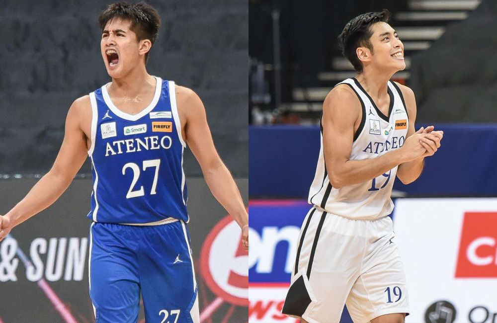
When you have Jordan Brand serving as your outfitter, you better deliver on the court.
The Blue Eagles are indeed doing that. They're not only the GOAT through the first round with their immaculate 7-0 record (and showing no signs of slowing down in the second), but they also have the coolest jerseys out there, at least by our standards.
Sticking to its simple yet iconic Times New Roman wordmark, Ateneo's uniform this season evokes nothing but class — just like how coach Tab Baldwin wants it.
The blue away jerseys are straight fire — easily the top of the class this year — while the white home jerseys stand out more with the black piping on the collar and side panels, a subtle yet effective tweak to what is already one of the best in the league.
DEAN'S LISTERS
UST
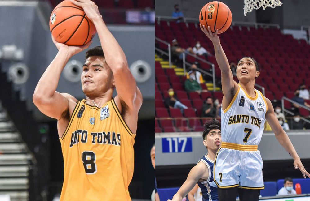
Clean, classy, and pleasing to the eyes. That's the best description of these sweet Growling Tigers jerseys, with the bold varsity block fonts a cool nod to the past.
It's also a big plus when UST can resist putting any tiger stripe patterns in the jersey, opting to stick to a simple white and gold scheme, while using slim black lines as accents on its neckline, sleeves, and shorts for its away uniforms.
These threads may not be the beautiful black jerseys the Espana crew had in season's past, but it still deserves to be considered among the best this year.
UP
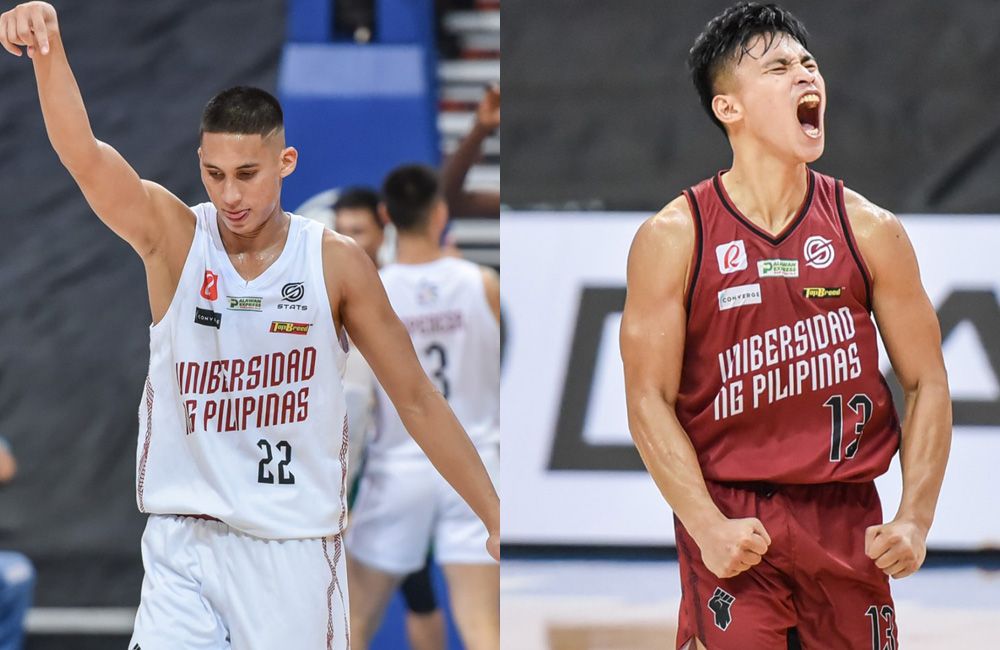
Less is really more for the Fighting Maroons as they ace this year's uniforms anew, as they've consistently done since the Plus63 redesign from 2015.
We even dare say that this might be the best UP jersey from STATS Apparel as it has done an excellent job in adding a subtle side panel pattern to make this season's threads pop a lot more.
The Fighting Maroons have also gone all out in using the Padayon typeface, while sticking with using black for the jersey numbers while keeping the Unibersidad ng Pilipinas text in maroon and white.
La Salle
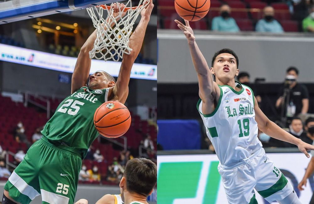
Not veering away from designs of seasons past, Nike once again went the minimalist route and stuck to what works for La Salle.
The Old English font is already iconic on its own, while the block typeface for the names and the numbers just works without being too loud.
The solitary square on both the side panels and the big horizontal bars on the shorts may be a confusing choice for some, but it's a design that doesn't really hurt the overall look for the green-and-whites.
PASSING GRADES
Adamson
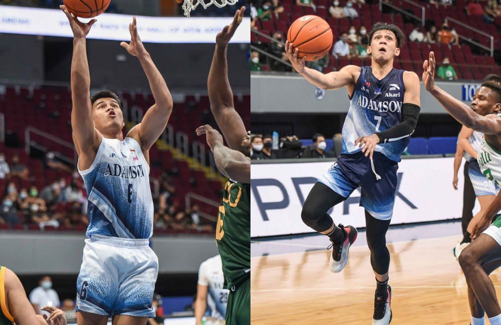
Credit Adamson for being audacious enough to use the gradient design for its uniforms.
Normally a hit or miss choice, this year's Soaring Falcons gradient threads are still passable, loud enough to be noticed but not too cluttered to be annoying.
Anta also gets a big plus for those cool blue thunder pattern jerseys that the Adamson coaches wear during the games. You all deserve more than one scoop of ice cream!
NU
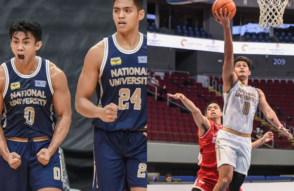
There's really not much to say about the NU jerseys, which have stuck to their plain blue-and-gold colors that has been largely okay in seasons past.
The only difference that the Bulldogs had this season are those curious linings on the side panels. Overall, it's just... alright.
But really, these jerseys might just be a perfect example on how coach Jeff Napa wanted these NU squad to be: competent enough to be competitive while not standing out that much — middle of the pack, right where it wants to be.
NEEDS IMPROVEMENT
FEU
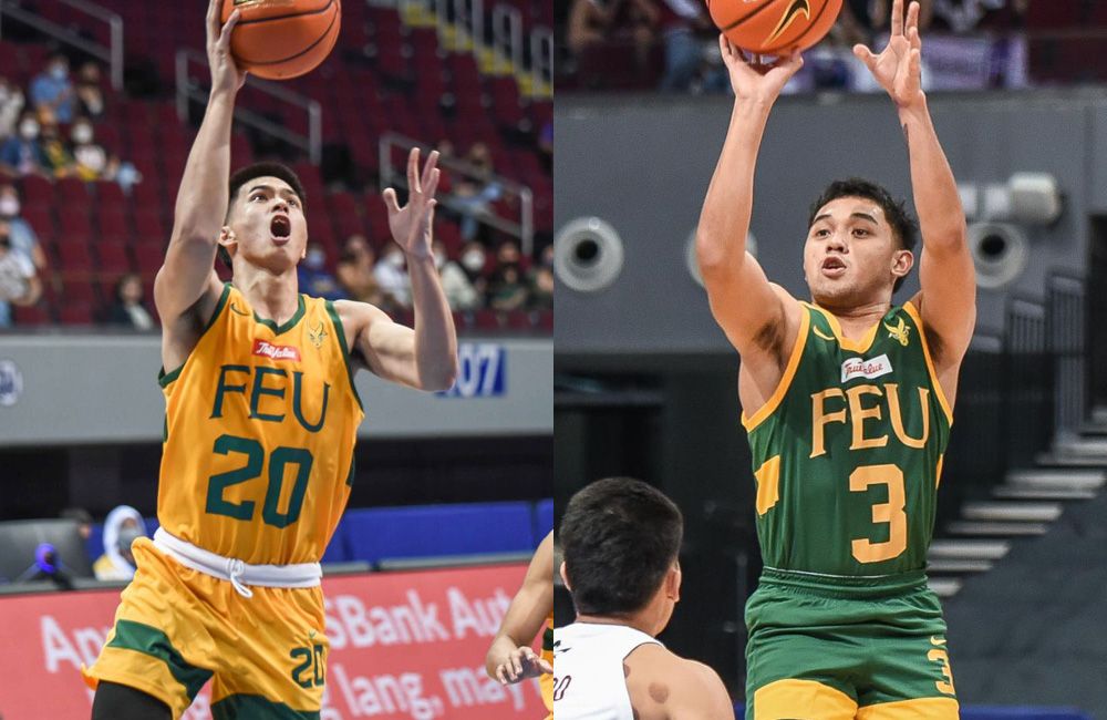
At first glance, there's really not much difference between the uniforms of La Salle and FEU, with both schools being outfitted by Nike.
But what ranked the Tamaraws this low are those exasperatingly big numbers on the front and the back of the jerseys.
It also doesn't help that there's a bit of an identity crisis with these threads. The FEU name is in its classy Palladio Bold font clashes with the aforementioned big block numbers and the surnames in the back written in slab serif typefaces.
Do better, Nike.
UE

I mean... what else can we say about the UE jerseys?
Ditching its simple yet classy uniforms from UAAP Season 82, the Red Warriors once again swung for the fences and horribly missed, which brings them here to the bottom of our jersey rankings — much like how they have fared so far in the standings.
The black and white bars on the side panels had good intentions, but the font choice and the confusing bevel shape for University of the East at the front (are they trying to make it look like those old baseball scoreboards?) as well as the plump block numbers (with drop shadows!) wasted what should have been a solid opportunity for UE.
Get more of the latest sports news & updates on SPIN.ph
NOTICE ON UNAUTHORIZED AND UNLAWFUL USE, PUBLICATION, AND/OR DISSEMINATION OF SPIN.PH CONTENT: Please be notified that any unauthorized and unlawful use, publication, and/or dissemination of Spin.ph’s content and/or materials is a direct violation of its legal and exclusive rights to the same, and shall be subject to appropriate legal action/s.