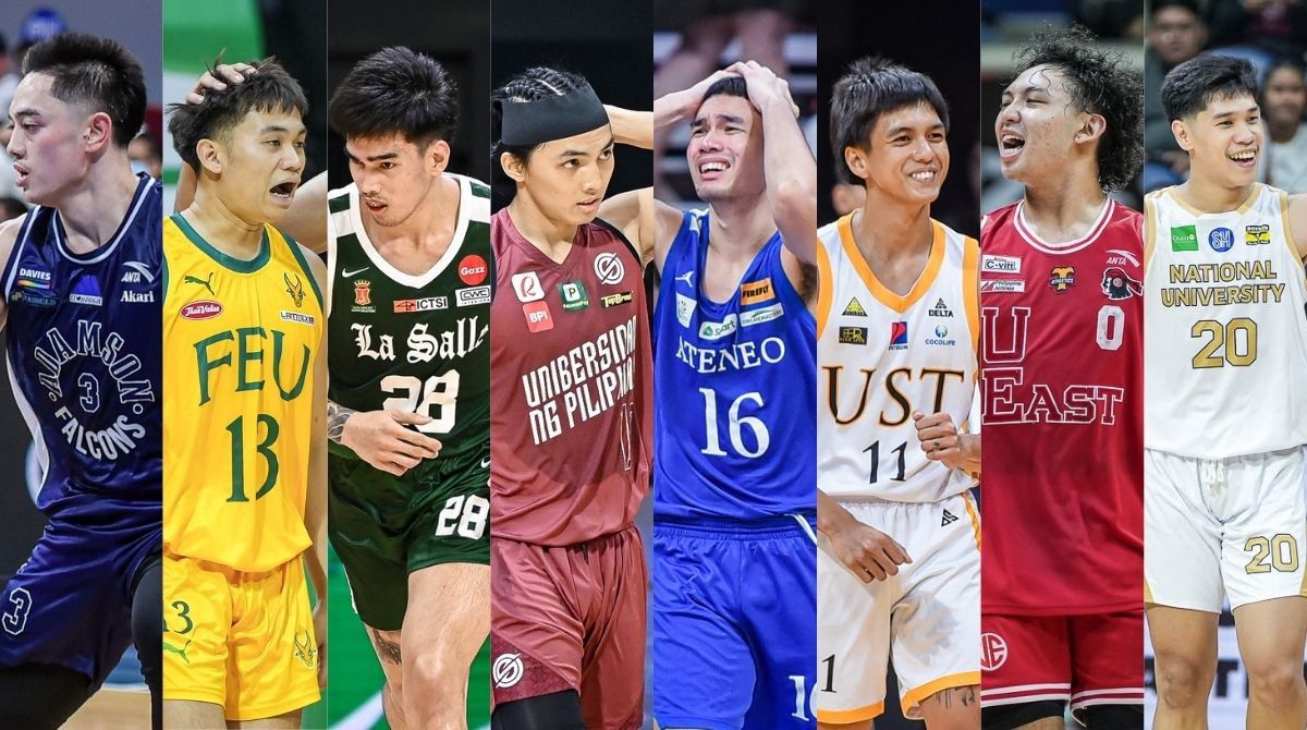
NEW season. New threads.
And UAAP teams did not disappoint, stepping their jersey games up as they not only try to be the best on the court, but also look good doing it.
It’s been a while since we did this and once again, still inspired by Paul Lukas' Uniwatch, SPIN.ph ranks the schools we think have the best uniforms this Season 87 men’s basketball tournament.
TOP OF THE CLASS
La Salle Green Archers
Kings must stand out from the field, right?
But for the defending champions, all they needed was to clean up their look a little bit.
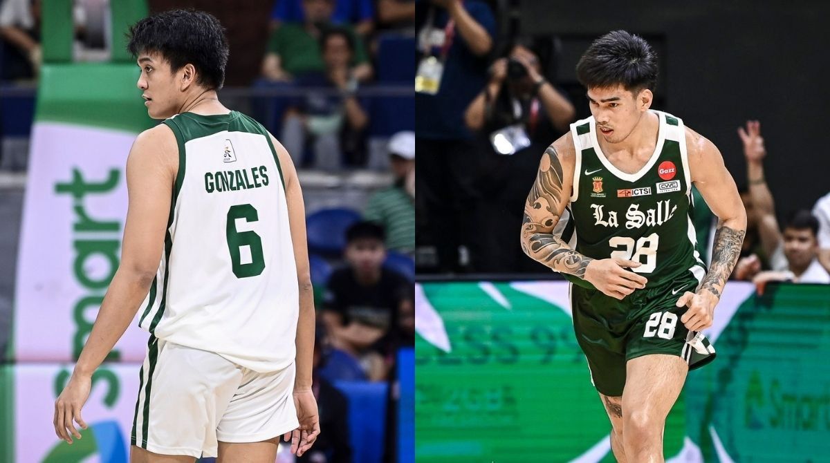
La Salle stuck with Nike’s signature minimalist look with just two lines on side panels while adding a block on the shoulder and upper back areas.
What puts their sleek jerseys over the top is how the Green Archers opted for a darker shade of green for their away uniforms, a nice deviation which is closer to their school color. That's the same color that the likes of Mike Cortez, Mac Cardona, and Joseph Yeo once wore.
All love to Jeron Teng and Ben Mbala, but that green isn't necessarily the La Salle green. So it's good to see reigning and defending Season and Finals MVP Kevin Quiambao get to wear the right one.
UST Growling Tigers
Speaking of clean, how about UST’s?
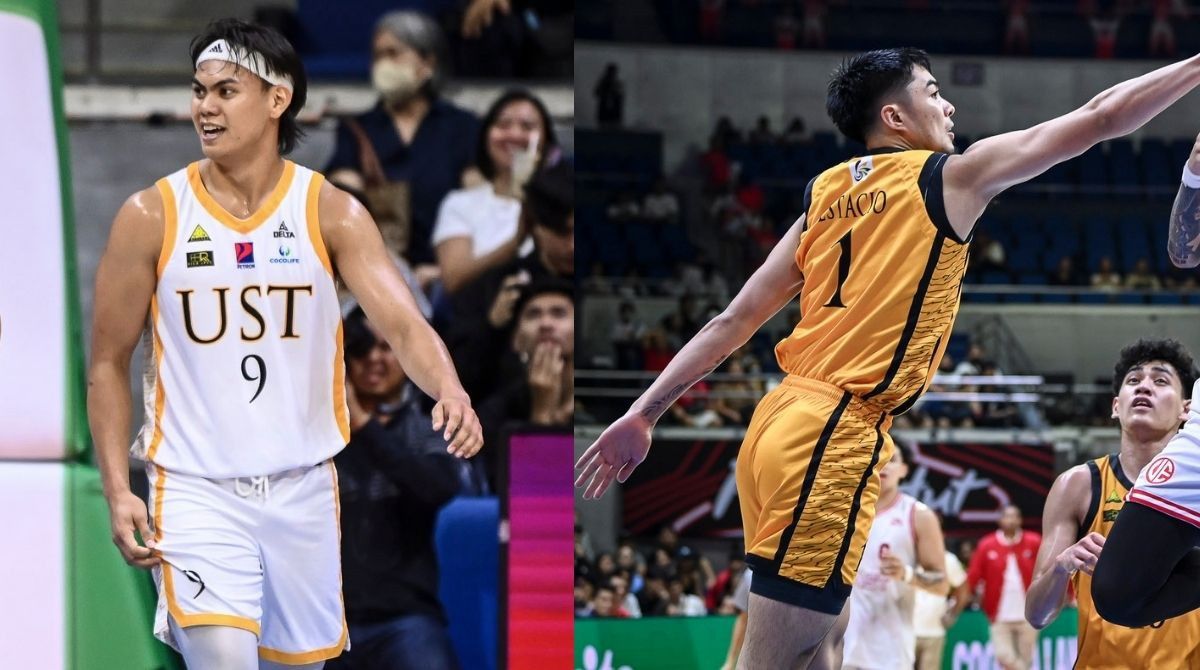
The Growling Tigers once again parade neat unis, keeping up with the times yet still maintaining elements from the past.
Delta Sportswear made a good call with the outlined tiger stripes on the side panels enclosed by solid lines.
UST may be dreaming to reach the Final Four, but it already earned its place in the top two with these kits.
DEAN’S LISTERS
Ateneo Blue Eagles
The Blue Eagles may be struggling on the court, but at least their jerseys aren't an eyesore.
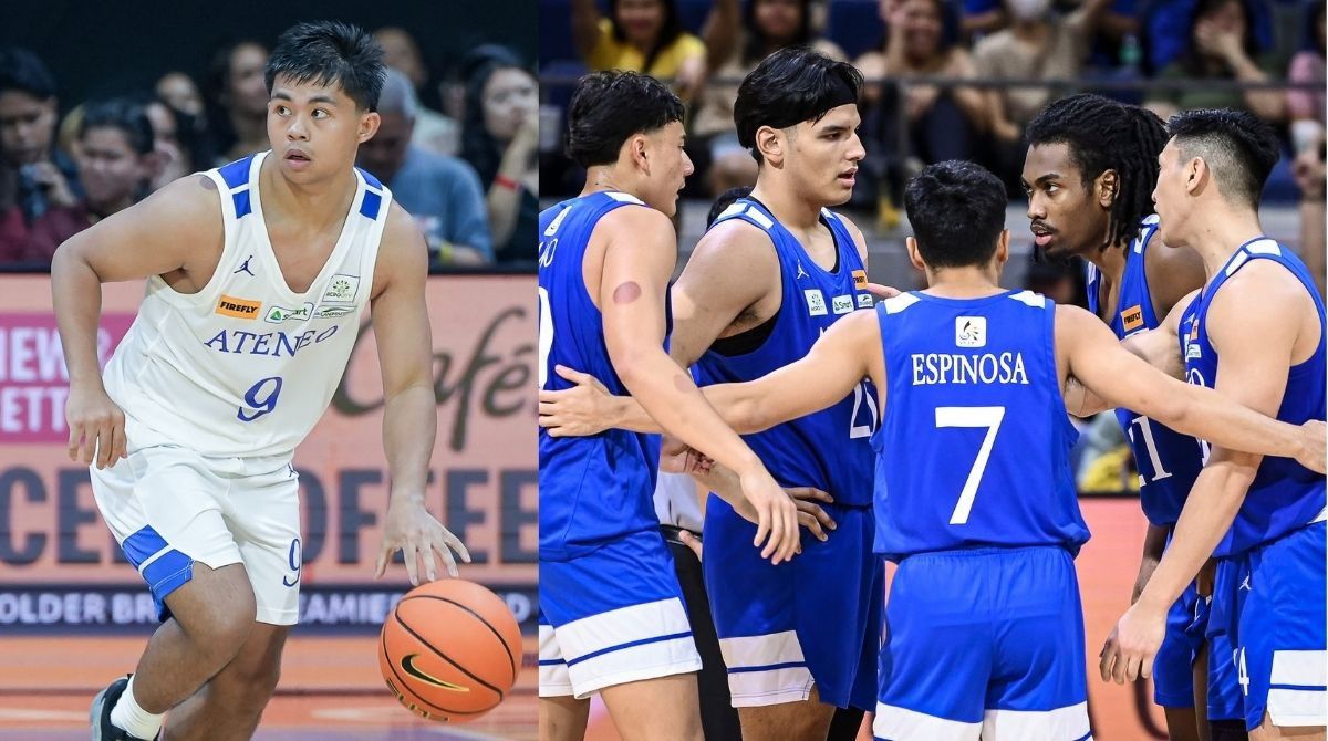
Ateneo has never deviated from its polished look, and it worked again this season by having two block lines on the shoulder and the hem of the shorts.
However, we feel that this ranking could be a bit higher had the Katipunan side stuck with its traditional Times New Roman font for the jersey numbers rather than the Linotype they used since last season.
UP Fighting Maroons
Nothing crazy here, just the Fighting Maroons going with their signature Plus63 redesign.
It’s a look that just works, with only minimal changes to the uniform template they first utilized back in Season 81 made by STATS Apparel.
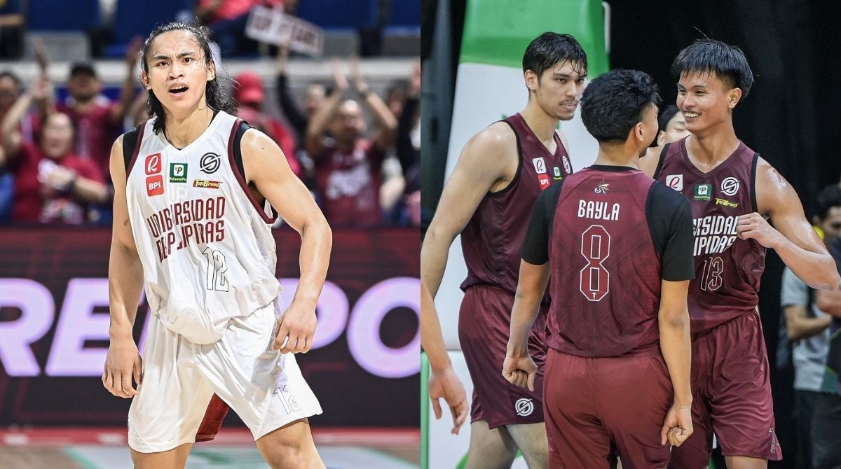
This year, UP opted to have clean side panels, but also still have an opaque State U-inspired pattern as backdrop to the back of the jerseys.
Outlining the jersey numbers, having it white-on-white and maroon-on-maroon, is an interesting choice but not a bad one.
Plus points as well for having a small Oblation at the bottom of the jersey numbers, reminiscent of those done in football kits. That, however, is negated by that weird lining at the bottom of the shorts just under the crotch area.
Adamson Soaring Falcons
Don’t fix what isn't broken, as they say.
And the Soaring Falcons did just that for the third straight season, parading their throwback jerseys which were made in honor of their iconic 1977 champion team.
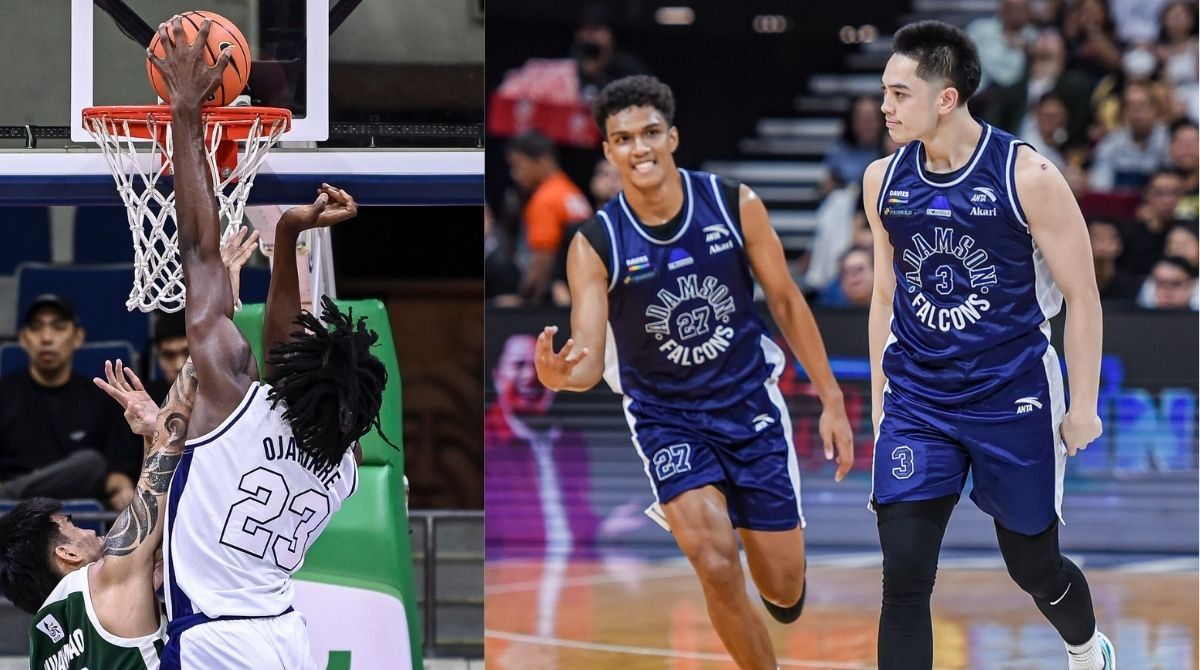
As we said years back, Anta hit it right on the head with the combination of the stenciled "Adamson" and sans serif "Falcons" name encircling the jersey number.
Though some could argue that it’s a copout for Adamson to not change its look, we’re still wishing for it to dare and mismatch those tops and bottoms.
PASSING GRADE
FEU Tamaraws
Easily, this is the Tamaraws’ best jersey since Puma took over.
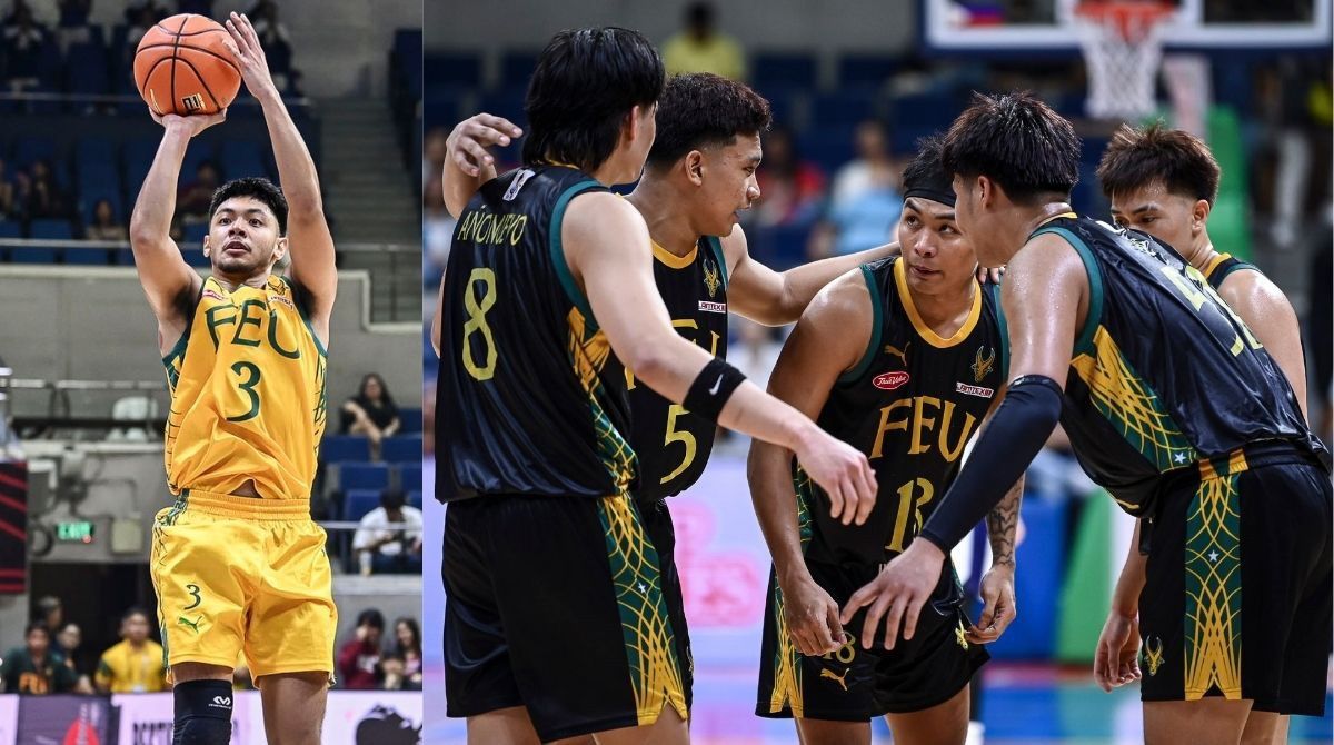
Ditching the highlighter greens that it used the past two seasons, FEU went bold with its choice of using black as its dark unis this year to make its gold font pop. The light jerseys are just as good, with the gold being the canvas for the traditional green font.
Another daring choice was the geometric design on the side panels. The pattern is a bit similar to the Sarimanok feathers seen on the school’s university seal, although we wish it could have been the eight-pointed star, which is also on FEU’s emblem, rather than a five-point star.
NEEDS IMPROVEMENT
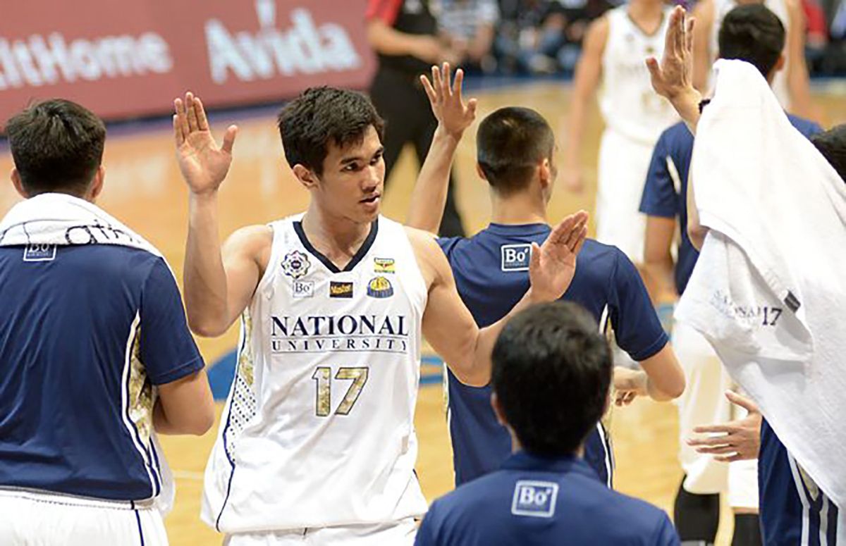
NU Bulldogs
Learning lessons from last season’s splatter design, the Bulldogs chose a cleaner look this year with a simple lining on the side panels.
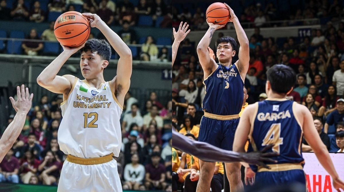
However, there’s a disconnect with “National University” and the players’ surnames in Calibri partnered with big block jersey numbers. It’s not that it doesn’t look good, it just looks like it’s two different uniforms being mishmashed together.
Make no mistake about it, NU has a neat jersey. It just lacks identity.
You know, the identity it already had with the unis once worn by Troy Rosario and Co.?
UE Red Warriors
Props to the Red Warriors for continuing to give a toast to their past, staying with the 1966 throwbacks they used last season.
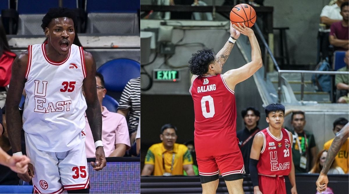
The outlined font, the vertical “UE” which turns to a horizontal “East” and the jersey numbers placed on the upper right of the chest are all unique design choice - which is one of a kind in the UAAP today.
But as refreshing as those vintage looks are, and also kudos to Anta for paying tribute, the novelty wanes the more you use it, much like in the case of Adamson.
The Red Warriors have a rich tradition when it comes to basketball, and we feel like there’s a lot more legendary squads - Recto has celebrated 18 men's championships, after all - they can pay tribute to every year.
Get more of the latest sports news & updates on SPIN.ph
NOTICE ON UNAUTHORIZED AND UNLAWFUL USE, PUBLICATION, AND/OR DISSEMINATION OF SPIN.PH CONTENT: Please be notified that any unauthorized and unlawful use, publication, and/or dissemination of Spin.ph’s content and/or materials is a direct violation of its legal and exclusive rights to the same, and shall be subject to appropriate legal action/s.