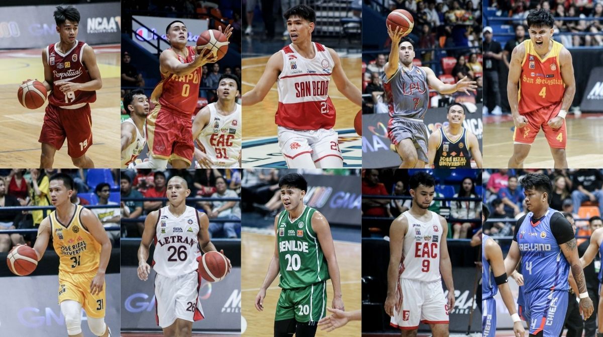
FRESH threads mean fresh outlook.
NCAA teams understand that as they play in the Centennial season of the Grand Old League with new uniforms.
READ: Who passes the In-Game Fit Check in UAAP Season 87?
Just like in the UAAP, it’s been a while since SPIN.ph borrowed this idea from Paul Lukas’ Uniwatch, but of course, there's no better time than right now for us to rank the best jerseys for the ongoing NCAA Season 100 seniors basketball tournament.
TOP OF THE CLASS
Benilde Blazers
Don’t fix what’s broken, right?
These ANTA jerseys, an homage to the 2001 championship team, just gets better with time and how fitting is it that the Blazers brought it back for the third straight year.
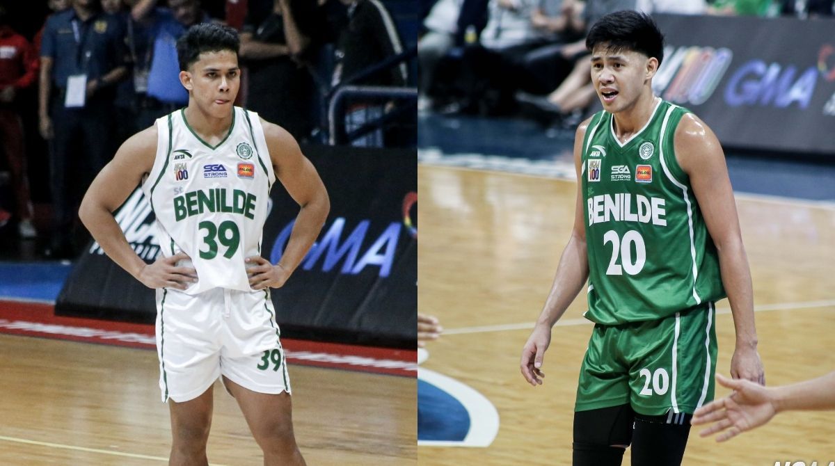
Emblematic of the Charles Tiu era in Taft, these jerseys were the ones Benilde wore when they ended their two-decade Final Four drought two years back. And how sweet would it be for these same uniforms to also be the ones to lift the NCAA championship trophy again by the end of the season.
That, however, is still yet to be decided, but for now, CSB are the kings when it comes to the threads.
Perpetual Altas
Simple tweaks may change a lot in the world of aesthetics and Perpetual aced this test greatly.

After years of experimenting, the Altas hit a homerun with their sports script font they first utilized last year and retained it for this season.
Opting for a clean look and pairing it with big, bold, block numbers where a gold outline accentuating the maroon color completes this beauty from World Balance, earning its place among the best.
San Beda Red Lions
The best two years back, San Beda still deserves its place in the podium with slight tweaks done to its 1977 championship jerseys.
ANTA has played with the elements of this classic, changing the lower part of the shirt to the reverse color which covers the jersey number and it still looks good.
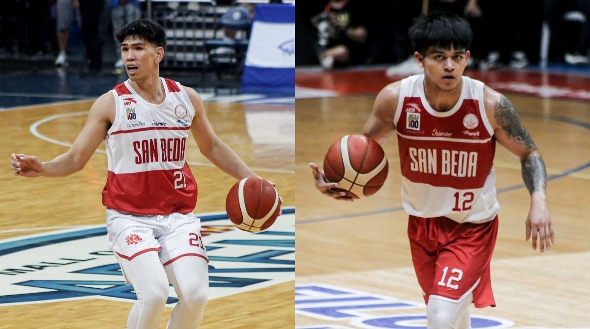
It’s still a vintage look, but beautifully done differently.
DEAN’S LISTERS
EAC Generals
Simplicity is beauty, and that’s the case for Emilio Aguinaldo College.
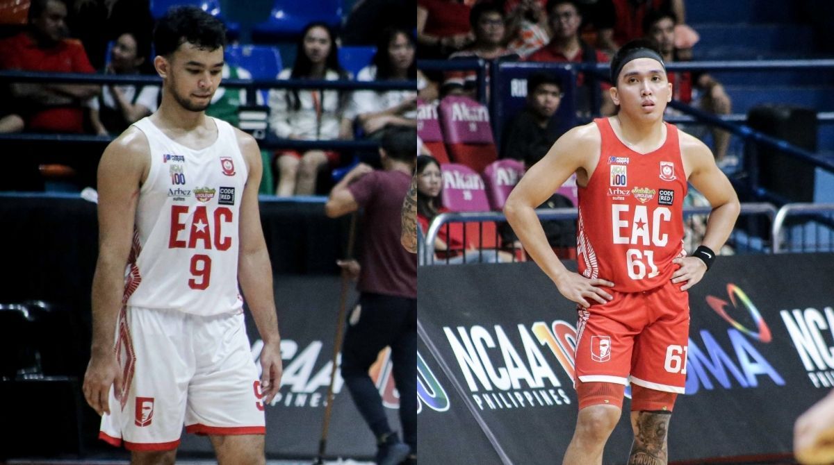
It’s easily the Generals’ best jersey to date, with Power Hoops executing a wonderful job in this one.
The diamonds on the side panels may be a little too wild for many, but it’s just the right amount of pizzazz to not make these unis not too boring.
Letran Knights
Letran’s first jersey under the ANTA banner was a throwback from the 1999 championship team.
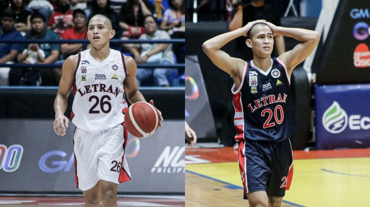
It’s a sleek look that pays homage to the past and gets some more brownie points for its simplicity.
However, we feel like it’s a little too simple all the more as the Knights deviate from the Old English look that they have been accustomed with in the past.
PASSING GRADE
JRU Heavy Bombers
Jose Rizal University didn’t need to do anything crazy. Its colors already do that for the Kalentong crew.
But Power Hoops made this one work for the Heavy Bombers, with the simple curved lining on the side panel completing this neat look.
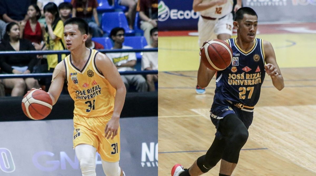
We say, this one’s just fine.
San Sebastian Golden Stags
One thing working for San Sebastian is its identity, with Kalos Sportswear sticking with the Old English text that has worked for years.

The choices to go with the simple block colors on the shoulder and the side panels also didn’t hurt the overall look for these clean jerseys.
This one gets decent marks from us.
NEEDS IMPROVEMENT
Mapua Cardinals
It’s much of the same case for Mapua which deviated from its Trajan Pro look to going all in with the Michigan State Spartans font for both the name and the number.

Minimalist in nature, the Cardinals take a little bit of a step down as they could have added a little more in this jersey.
Sad to say, it’s a little bit plain, uninteresting even.
Arellano Chiefs
Look, give Arellano credit for trying.
Changing the blues to baby blues is a daring choice especially if gray is your other color.
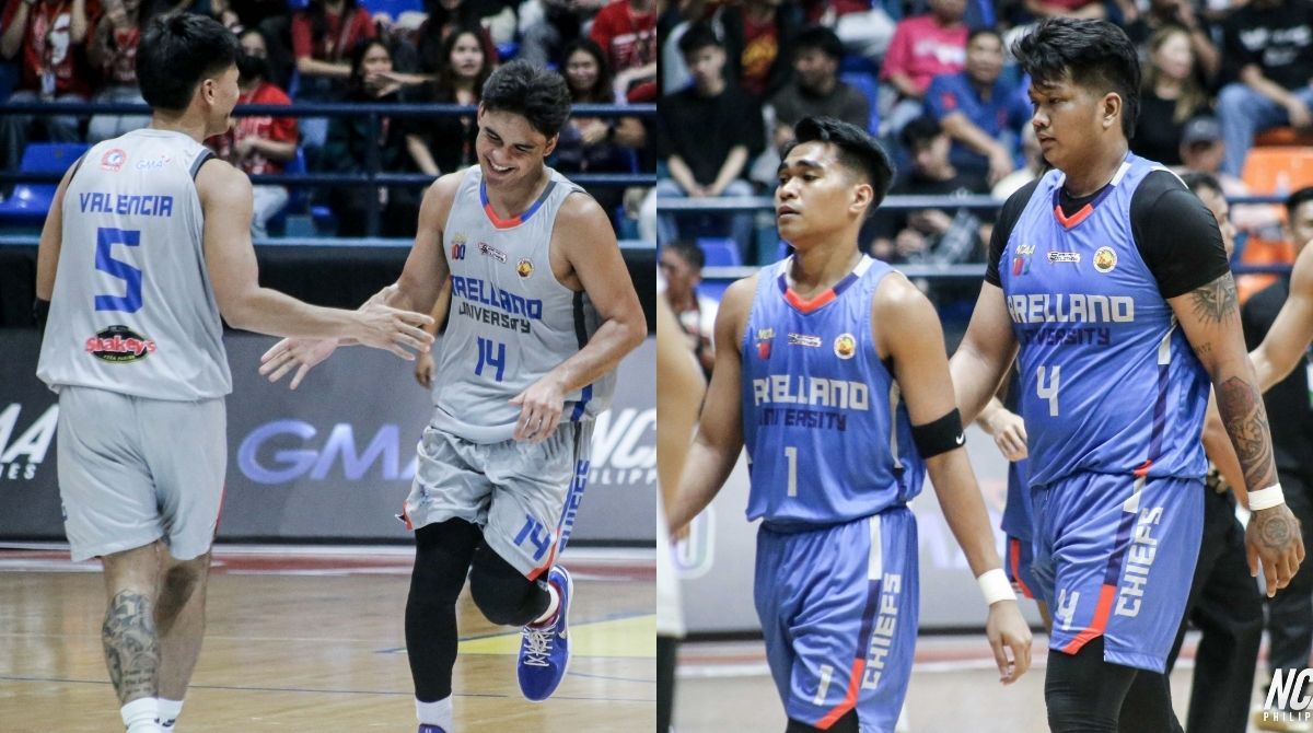
But we do not dig adding the “Chiefs” text on the side panels and the differently colored blocks to outline the collar, arm holes, and even the side panels. That’s just a bit too much.
LPU Pirates
Talk about going wild.
LPU was one of the best uniforms in college years back, but their decision to go with pinstripes – in a red and gray color scheme, we should note – was an interesting choice.
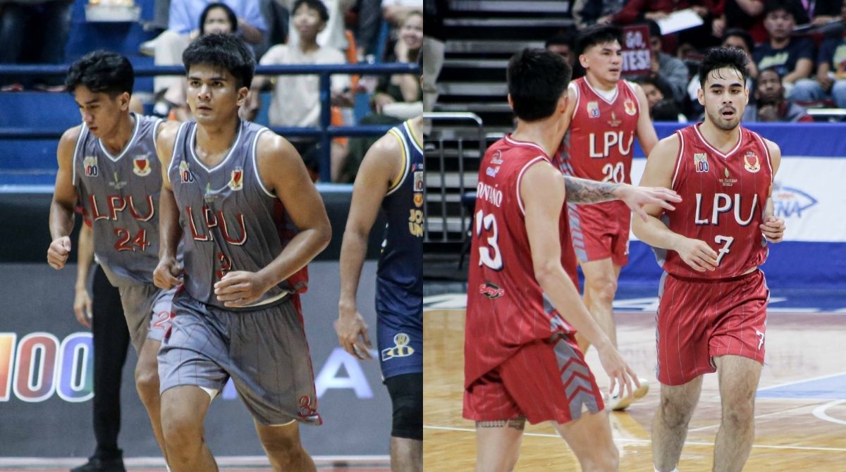
And we haven’t even started talking about adding shadows to the text and the quirky number font.
Easily, this one’s a miss.
Get more of the latest sports news & updates on SPIN.ph
NOTICE ON UNAUTHORIZED AND UNLAWFUL USE, PUBLICATION, AND/OR DISSEMINATION OF SPIN.PH CONTENT: Please be notified that any unauthorized and unlawful use, publication, and/or dissemination of Spin.ph’s content and/or materials is a direct violation of its legal and exclusive rights to the same, and shall be subject to appropriate legal action/s.