ON JANUARY 4, the profile picture of the TNC Predator Facebook page turned black, and local esports fans began talking.
“You gotta be kidding me,” wrote streamer and athlete Eric “Eruption” Tai in the Facebook comments section. Speculation ran hot as the page’s numerous followers debated the meaning of the sudden change.
Two days later, TNC Predator revealed the real reason they did it, as they showed off their brand new logo.
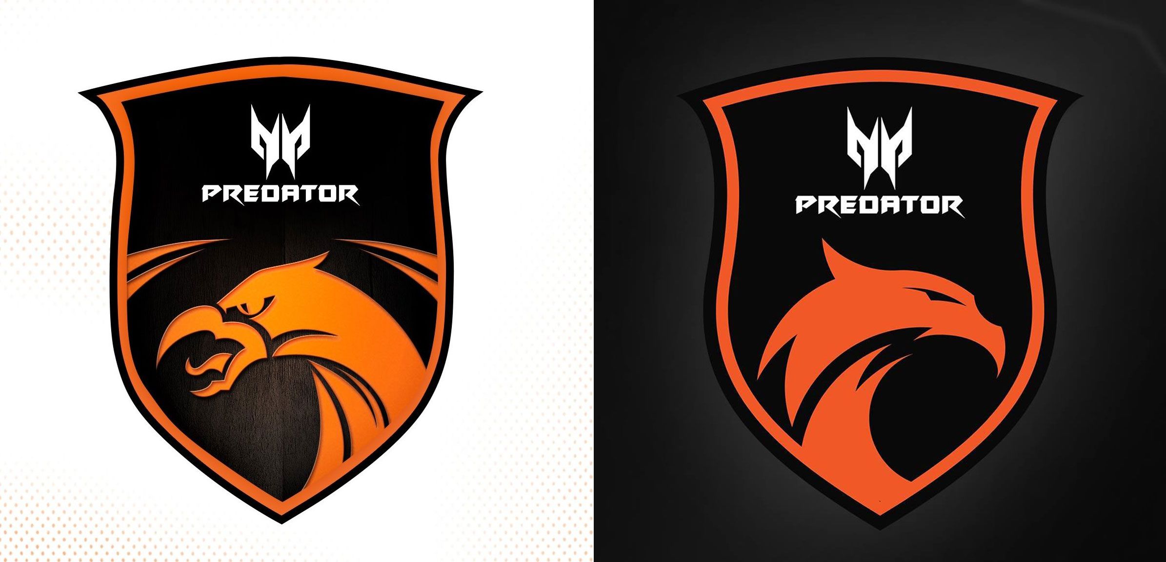
Gone was the open-beaked, tongue-out snarl of the team’s symbolic phoenix, clearly inspired by medieval heraldry. In its place was the cleaner, sleeker, sharper arc of a brand new apex predator.
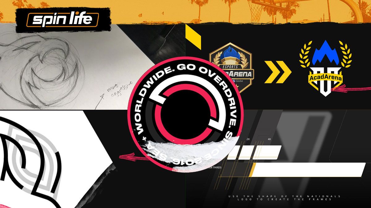
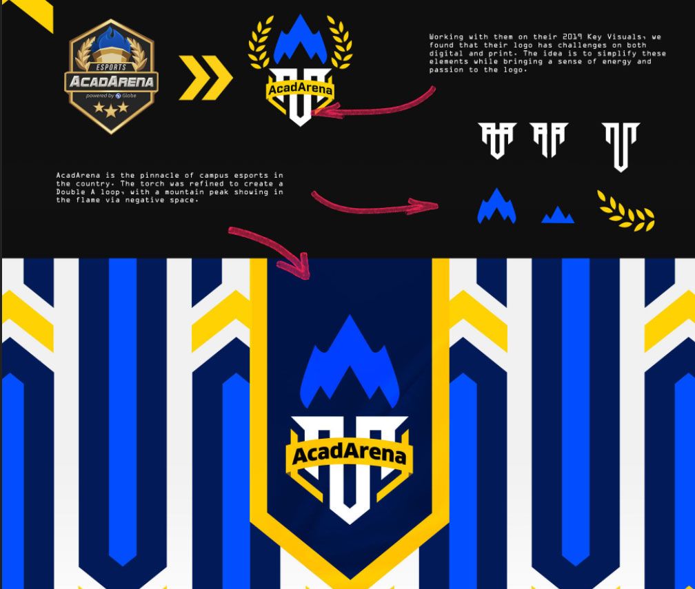
“When you see the [old] TNC logo, one of the problems I had when we did the research for them was the logo was actually very complicated,” said RD Rogacion, founder and CEO of Overdrive, the graphic design and branding studio that spearheaded TNC’s brand-new look.
The organization, Rogacion said in an interview with SPIN Life, found it was having a hard time translating the original logo into all the surfaces and use cases they needed their phoenix on.
For example, “Di siya masyadong kita sa jersey nila. And then there's a lot of edges that are very hard to lay out in signage and stickers and stuff like that, because they have to make sure every edge is perfect.”
So, pencil in hand, Rogacion got to work trimming the feathers, so to speak, of TNC’s phoenix.
Livin' la vida logo
Rogacion follows three important principles when it comes to logo design.
Number one, it has to be appropriate. “If it's supposed to be for gaming, there has to be a certain look that has to be followed: bold, dynamic, in your face,” she said.
Number two, it has to be memorable. “Maaalala mo [dapat] itsura niya.”
Finally, “The last thing I emphasize in making logos is simplicity,” she explained. “Kasi, you have to make sure logos are made in a way na you can reproduce them in any way you can, any color, any background, any size.”
It’s a philosophy she’s been following since she set up the studio back in 2016. Back then, it was just a one-person operation. But in 2019, she knew she needed to expand as a raft of heavy-duty client projects arrived in her inbox.
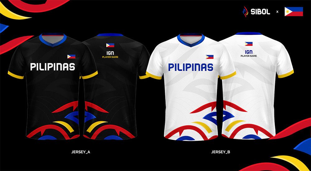
Among them? Creating the entire branding for the Philippine national esports team for the SEA Games. And when the client brief said “entire branding”, it really meant it: name, logo, jersey, key visuals — everything.
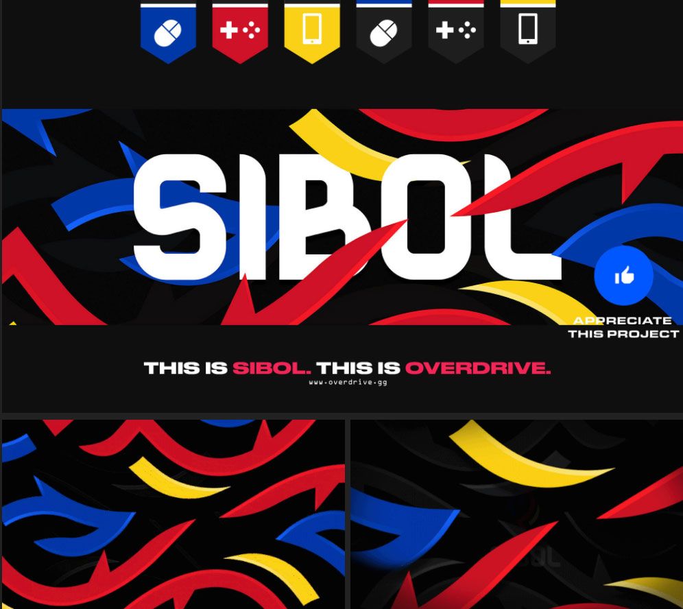
“I was in a coffee shop at the time nung na-confirm yung project,” she recalled. “I was with my girlfriend at the time, who is my ex now. We were trying to think of names, and one of the names that really popped up was Sibol.”
Inspired, Rogacion singled it out from the pile of sticky notes she’d been scribbling on.
“Sibol made sense,” she said. “Esports is a growing industry, and you wanna show everyone na growing talaga ang mga Filipino players.”
Plus, it had that same solid, two-syllable punch as Gilas. “Kailangan medyo maangas.”
Timelines were tight. The games were still in December, but there was marketing, there was the qualifiers, there was an entire promotional schedule to herald the official entry of esports into the regional games — as well as the team that would carry the country’s banner. But Overdrive was used to tough turnarounds.
Come presentation time, Rogacion, then just 24 years old, found herself in a boardroom filled with the movers and shakers behind the esports industry.
“Not a lot of people knew me there. ‘Sino ba 'tong bata na 'to na parang andun lang?’ I was surrounded by people who were very much older than me,” she remembered.
The pitch was a home run. Everything — from the name, to the color palette, to the flame/leaf mark that would become the team logo, to the font inspired by jeepney signs — “They loved it naman. Even how they found the concept,” said Rogacion. “Very happy about that.”
Meta moves
At present, Overdrive is a team of nine, composed of both part-timers and full-timers.
Rogacion is still very much hands-on with the business, especially in the graphic design side. “[But] a lot of our work isn’t just a logo,” she stressed. “We also do broadcast assets, all the jerseys, all the social media stuff.”
At the end of a project, the studio will usually turn over to the client a complete style bible for its branding.
“We will make a design language for everything,” Rogacion said. “We'll break down how the fonts look, how the sizes are going to be like, what are the layouts, what are the shapes that are going to be used for brackets, or stand-ins, or logo containers and stuff like that, what elements are going to be used. We document [all that] stuff into a manual para people who'll be using them have a guide to execute it in a good way.”
In an article published in the Inquirer last year, Rogacion wrote about the struggles it took to get Overdrive into gear, and how she purposely chose the long, hard road to stay independent and build her own business.
Now that her studio is growing, the 26-year-old graphic designer is experiencing the familiar growing pains of a creative startup.
“I was a solo freelancer before, [so] it's hard for me to entrust my baby to other people,” she said. “I have a sense of attachment. That's the thing I've been working on ever since nabuo ko na yung Overdrive as a company.”
International esports brands have sat up and taken notice, booking Overdrive for design projects. As a studio, it’s currently at the forefront of graphic design in a regional industry that’s growing in leaps and bounds.
That suits Rogacion just fine. She's an avid gamer herself, and, as a Dota fan, even lined up at the momentous Manila Major back in 2016. She’s also a big sports fan, and relishes the challenge of making the gaming and sports world meet in the middle, at least from a visual perspective.
She explained: “A lot of things that are common in sports and gaming is, it's in your face, it's exciting, it's bold. They use a lot of strong lines and strong colors, so it's easy to integrate it into design.”
With Overdrive’s reputation and roster of clients, does she feel that she, as a designer, is being pigeonholed?
“Not yet. This is still an industry that's going,” Rogacion said. “There's a lot of opportunities for me to produce different kinds of work, more meaningful work. I don't believe na napapako ako.”
The time might eventually come, she said, when she would move on to another field, stretch her horizons in design. But for now, “I want to really do good in esports.”
And for other esports designers out there, what advice would she give to make their work look better?
Rogacion’s answer is straight-up textbook.
“One of the unspoken rules if you want to improve your graphic design [is] you have to settle your typography [and] how [you] use fonts,” she said. “I want to fix all of the teams' typography and how they structure their layouts, text-wise. That would change a lot of things for a lot of teams.”
Get more of the latest sports news & updates on SPIN.ph
NOTICE ON UNAUTHORIZED AND UNLAWFUL USE, PUBLICATION, AND/OR DISSEMINATION OF SPIN.PH CONTENT: Please be notified that any unauthorized and unlawful use, publication, and/or dissemination of Spin.ph’s content and/or materials is a direct violation of its legal and exclusive rights to the same, and shall be subject to appropriate legal action/s.